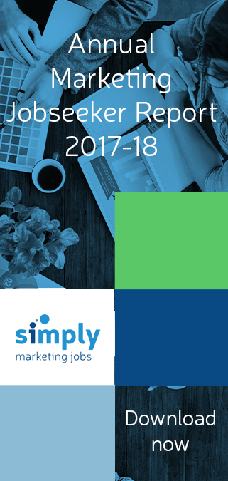

As a marketer, you can’t help but have heard of ‘Mobilegeddon’ – Google’s latest algorithm update that priorities websites based on how ‘mobile-friendly’ they appear to be.
There’s been plenty of talk and tweets on the subject, so we’ve put together a quick guide to sources of useful information on the topic now it’s started rolling out…
Check The Impact On Your Website
With all the articles forewarning of huge traffic losses and reduced rankings, you’re right to want to check if your site has been affected, for better or worse, by the update. Handily, Dave Chaffey at Smart Insights has put together a really useful guide of how to use Google Analytics to do just that. Don’t worry – it’s not going to take you an hour to decipher it! In 3 steps (with a screenshot for each) you’ll be able to easily monitor the effects of the update on your site.
How To Format Your Content For Mobile-Friendly Pages
If you already have a mobile-friendly website then that’s great, but now you need to make sure your content looks great on any device too! Search Engine Watch have put together 6 easy to follow tips to help you do just that. Most of these are really simple things that you may not have even though of, but will do a lot for user experience for your mobile visitors – simply using shorter paragraphs will avoid giant text blocks on smaller screens, for example. Check out the full list here, and be sure to start implementing them straight away!
I Don’t Have A Mobile Site – Where Do I Start ?
If you’ve not got a responsive site yet, then it is certainly not too late. Google recrawls so regularly that you can re-index your site as a mobile-friendly URL within days of it going live. But, if you’re not sure where to start with this then we recommend looking at this article on Social Media Today. A long with 5 general design guidelines, the lovely folk at SMT also offer pros and cons on the different ways you can go mobile – namely responsive design (where the content resizes itself), dynamic serving (a separate design is used for moible, but on the same URL as the desktop site), and a separate mobile site URL. This is a really helpful article and worth a read if you are now planning your mobile site!
Is jobhunting just like dating?
Ever noticed how a jobhunt is a lot like dating? There are a number of reasons why the stress of a job search can be compared to courting. In this blog post, we discuss why, and we hear from David Wiseman, a leader in digital brand reputation...

The busy marketer’s guide to being kind to yourself
In the fast-paced world of marketing, it’s become increasingly important to be more proactive in taking care of yourself and your mental well being. As we’re a caring bunch over here at Simply Marketing, we’ve compiled our top 7 quick tips on how to be...

What does a graduate marketing role look like?
Marketing is a fast-paced, constantly evolving role that is perfect for an ambitious and organised individual looking for a new challenge. If you’re fresh out of university and considering a role in marketing, this is what you can expect from...